
Welcome to UA Bites, a series where we analyze the creatives apps and games use to acquire more users, and catalyst growth.
We’re taking ad creatives under the microscope to understand what works and what doesn’t when it comes to paid performance.
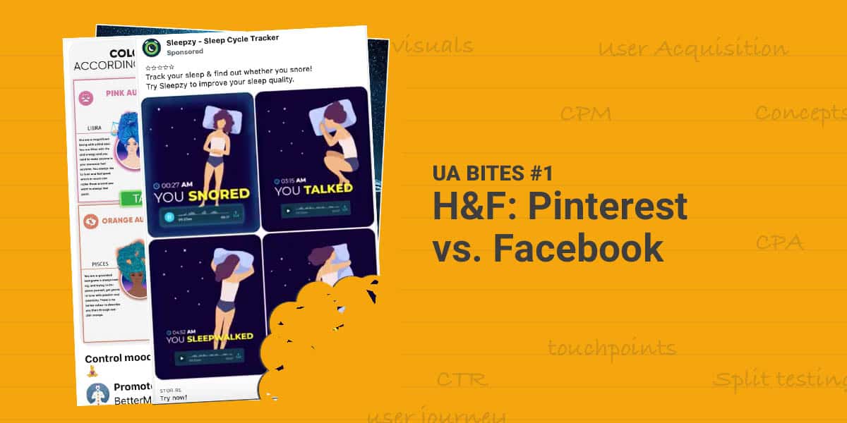
1. Sleepzy
You can’t just use something that outperformed on Facebook and expect it to be just as good on Youtube. (And vice versa.)
People are coming to all platforms with different expectations and for different reasons. You need to package the message accordingly.
Hopefully, they run this piece on TikTok as well. Apart from that a couple of things done right:
- Simple layout — you don’t have to think a lot what it’s about — it’s easy for the eye to consume. You’re quickly realizing what’s going on as a viewer and that’s key.
- It’s fast — lots of things happening in 12 secs. Well, not that much but you feel like it.
- Attention-grabbing — The creative catches the attention right at the beginning.
How they do that? — There is something unusual happening right at the start (the snoring).
- My favorite combo: low production cost + high-quality content — it doesn’t take too much time and effort to produce which is always a plus with rapid testings of the performance world. On the other hand, it’s still high quality!
- Colors — text is smaller but you can still easily read if you want.
- Positive emotion — Somewhat draws a funny/nice picture of sleeping patterns
There are a few downsides too:
- Noises — It’s heavily relying on noises and sound — according to multiple studies (like this one from Verizon) 80–90% of videos are watched muted. I’m not sure this ad has the same impact without sound thought. Also, it might be a trigger for a lot if you’re overdoing it in the audio department (especially at the beginning of the video).
- Poor copywriting — more like … no copywriting at all, nada!
Takeaway: if it’s a hit in the initial tests it’s definitely worth playing around while coming up with new concepts (as usual).
2. Alo Moves (vs. BetterMe) on Pinterest
I couldn’t really settle with just one brand here … so we’re going with two:
Alo Moves — it’s nice content, high production value overall.
Pretty paced which makes it more interesting and sort of gives you the sensation of working out.
But it’s pretty ‘basic’ content in the world of fitness. I know… everyone makes content like this cause it works.
My only problem is that it does not particularly fit the ‘Pinterest experience’. You would expect something more suited for the platform. But if it works… it works.🤷♀️
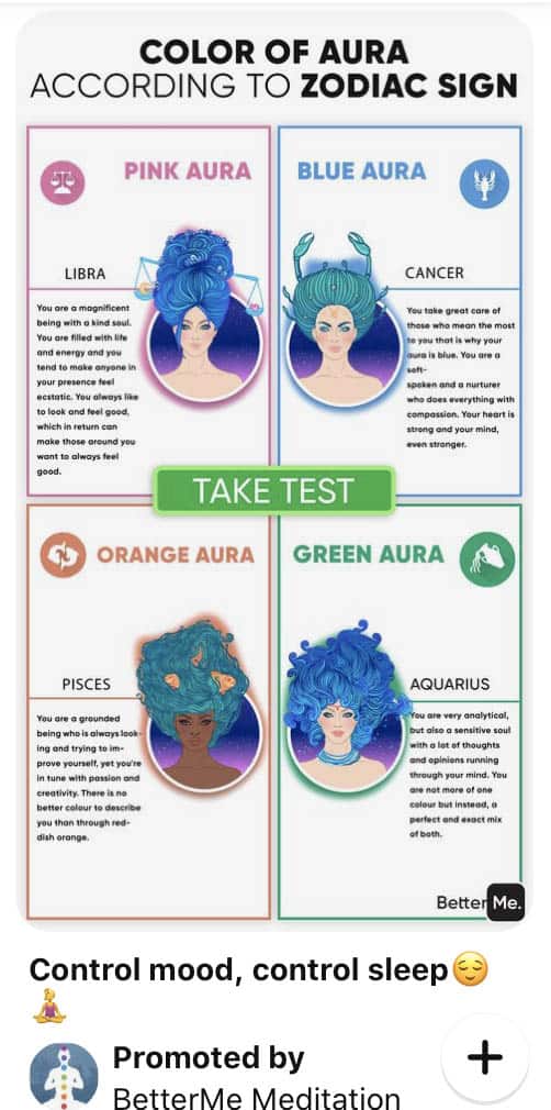
Here’s another one from BetterMe Meditation:
Okay, so with the LP landing you here (which is a basic onboarding questionnaire they use) — well, it’s pretty misleading stuff.
But the content fits Pinterest very well. So when making content for/to a new platform, you should not only be thinking about your brand and your message but also about why people are going to that particular platform.
In this case, people usually get inspired, unwind some time / relax, connect with others, and do many more on the platform.
Filling out a form (which people really like) can be really unwinding. So it’s very on-point.
Forms and tests are particularly popular among women so as Pinterest so again, it’s quite well-done.
It also has a good color variation. Plus, it makes good content on its own as it gives some real value in the Auras’ description.
3. Moodnotes
The video material itself could have more brightness. I understand that some might use it in bed and they might try to recreate that moment. But they didn’t quite succeed with that imo.
The script has definitely not been done by a copywriter — it lacks structure, emotional triggers. On the plus side, it’s good the script (or some of it) is written on the screen as a lot is going to watch the video muted.
Also, is it a voice-over? It’s a bit too much however blending in background sounds was a great idea. It adds some pace to the video.
Anyhow, the concept is worth trying.
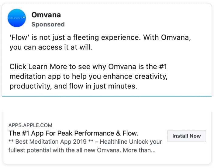
4. Omvana
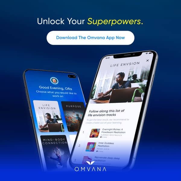
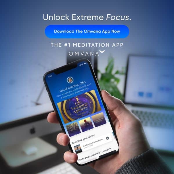
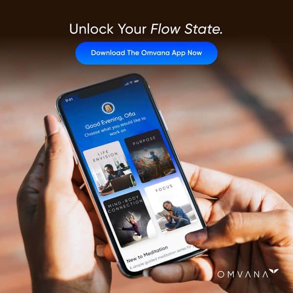
They only test a couple of single images like these for now. So what are they really doing?
They’re testing different messages trying to position the product in the market.
So they have the value props packaged and delivered the way it resonates most with the target market.
When using single images: you’re either doing retargeting / re-engagement campaigns so the ones targeted are already aware of your product OR it’s for cold traffic and then you need to use a longer copy than usual.
Well, there’s the 3rd scenario when you’re testing messages on single images as they do then a shorter copy will cut it too👇
5. Synctuition Mindspa Meditation
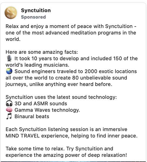
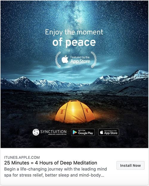
A good example of a well-done single image. It’s rich on the design and copy side as well. Super-low production costs as this can be a stock photo.
Notice the contrasting colors in the photo. It’s a nice picture but still very well-curated or edited so that it does the job of catching attention.
It also has a ‘trust badge’ in the middle of the picture about App Store Features.
The copy is slightly longer and does a great job:
‘Calling’ you to relax WITH the brand. And then positioning Synctuition saying they have ‘the most advanced meditation programs in the world’.
‘Some amazing facts’ follow that make the post more valuable on its own.
In the end, it reflects on relaxation and makes Synctuition sort of equal with it. Followed by a CTA — as it should!